Multi-layer perceptron: California housing dataset
October 05, 2025
In these next posts we will learn a little bit about hyperparameter tuning and debugging. This week, I will discuss the data set we will be using and next week we will start training the model.
When deciding on what model and dataset to use, I realized that I previously jumped straight into convolutional neural networks without first explaining the multi-layer perceptron (MLP). Although it got some coverage in my post on convolutional neural networks, I figured it would be a good idea to go back and touch on it again. I will not be extremely verbose about it since the focus of these posts is on hyperparameter tuning and debugging.
We will be using is the California housing dataset to train and evaluate our model. This dataset contains aggregated data regarding each district in California such as median income, population, and location (Latitude and longitude). Here is a snippet of what the data looks like:
| MedInc | HouseAge | AveRooms | AveBedrms | Population | AveOccup | Latitude | Longitude | MedHouseVal |
|---|---|---|---|---|---|---|---|---|
| 8.3252 | 41 | 6.98413 | 1.02381 | 322 | 2.55556 | 37.88 | -122.23 | 4.526 |
| 8.3014 | 21 | 6.23814 | 0.97188 | 2401 | 2.10984 | 37.86 | -122.22 | 3.585 |
| 7.2574 | 52 | 8.28814 | 1.07345 | 496 | 2.80226 | 37.85 | -122.24 | 3.521 |
| 5.6431 | 52 | 5.81735 | 1.07306 | 558 | 2.54795 | 37.85 | -122.25 | 3.413 |
| 3.8462 | 52 | 6.28185 | 1.08108 | 565 | 2.18147 | 37.85 | -122.25 | 3.422 |
Let’s look at some statistics. As a note, the incomes displayed are all in tens of thousands of dollars (i.e. 1.23 = $12,300).
             MedInc     AveBedrms      AveOccup
count  20640.000000  20640.000000  20640.000000
mean       3.870671      1.096675      3.070655
std        1.899822      0.473911     10.386050
min        0.499900      0.333333      0.692308
25%        2.563400      1.006079      2.429741
50%        3.534800      1.048780      2.818116
75%        4.743250      1.099526      3.282261
max       15.000100     34.066667   1243.333333
From the table above, we see that the average income is $38,700. Additionally, the average number of bedrooms per household is 1 with an average number of occupants being 3. While some values seem reasonable, others don’t make sense. For example, the max of average number of occupants 1243. This seems unlikely and is probably caused by how the consensus data was recorded. For example, we don’t knw how college dorms, apartment complexes, and prisons were accounted for. We can remove these outliers from the dataset so that we can have a better understanding of the average household by using the interquartile range and only keeping the middle 50% of the dataset:
Q1 = df_housing.quantile(0.25)
Q3 = df_housing.quantile(0.75)
IQR = Q3 - Q1

df_housing = df_housing[~((df_housing < (Q1 - 1.5 * IQR)) | (df_housing > (Q3 + 1.5 * IQR))).any(axis=1)]
Taking a look at the statistics again gives:
             MedInc     AveBedrms      AveOccup
count  16312.000000  16312.000000  16312.000000
mean       3.657930      1.047226      2.865163
std        1.444641      0.066569      0.624931
min        0.536000      0.866013      1.161290
25%        2.561150      1.002732      2.437060
50%        3.494650      1.043733      2.814886
75%        4.583300      1.088686      3.245208
max        8.011300      1.239521      4.560748
This is much more reasonable. Now, the median income is $36,579. Additionally, the average number of occupants is now ~4.5 per household and average number of bedrooms is 1. While this may seem strange, this data most likely considers spaces like studios and small units, which is probably the standard in expensive and overpopulated places like Los Angeles and San Fransciso.
We can plot the feature distributions to get a better idea of the underlying statistics:
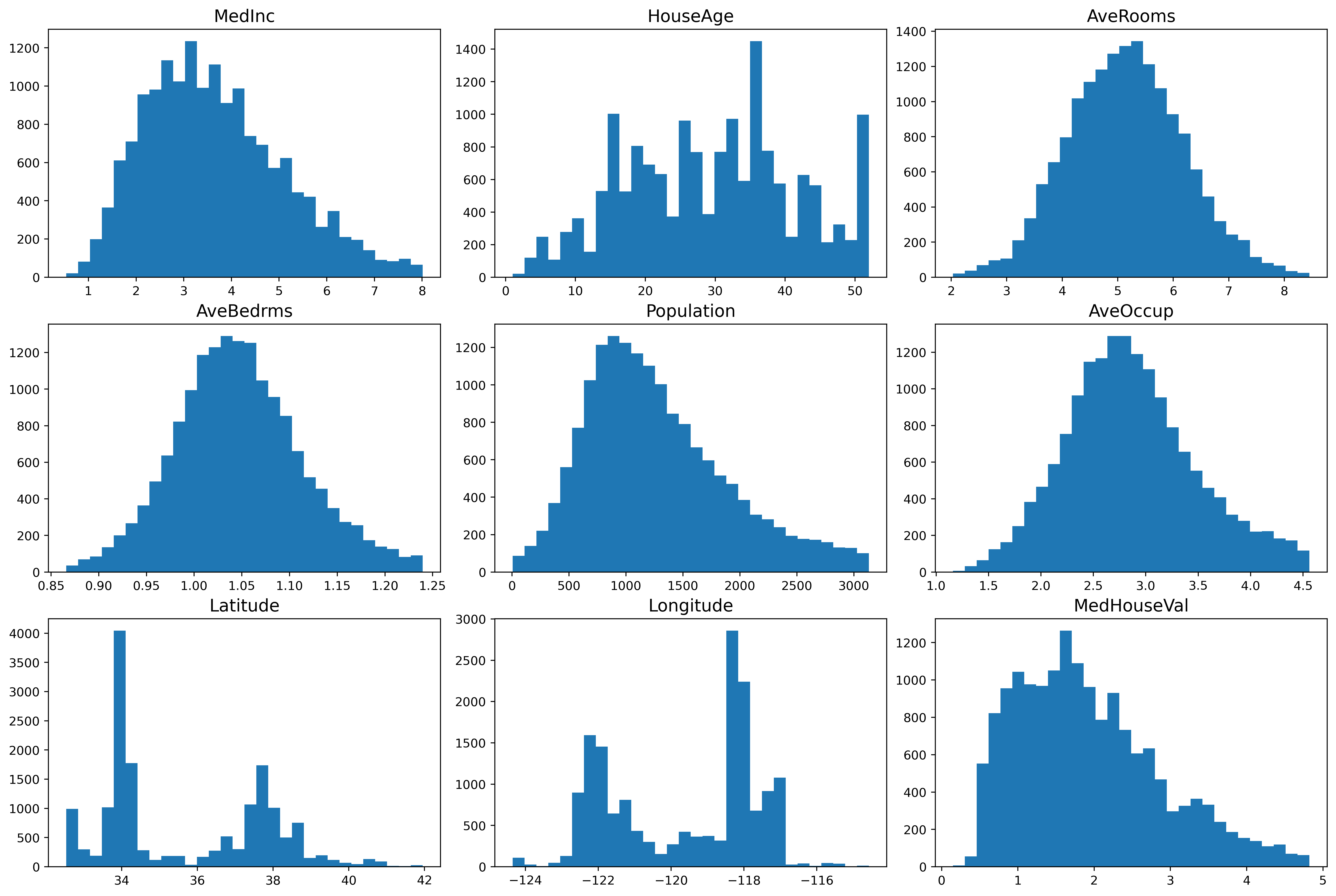
From the plot, we see different details regarding the features. One such detail is that the median income is mostly a normal distribution, but it is slightly skewed and has a heavy tail towards the higher incomes. This means that there are people with a high salary, although not many. Looking at the latitude and longitude plots, we can discern that there are two places in California where the housing prices are towards the higher end. The median house value data is also slightly skewed and has a heavy tail towards the higher values.
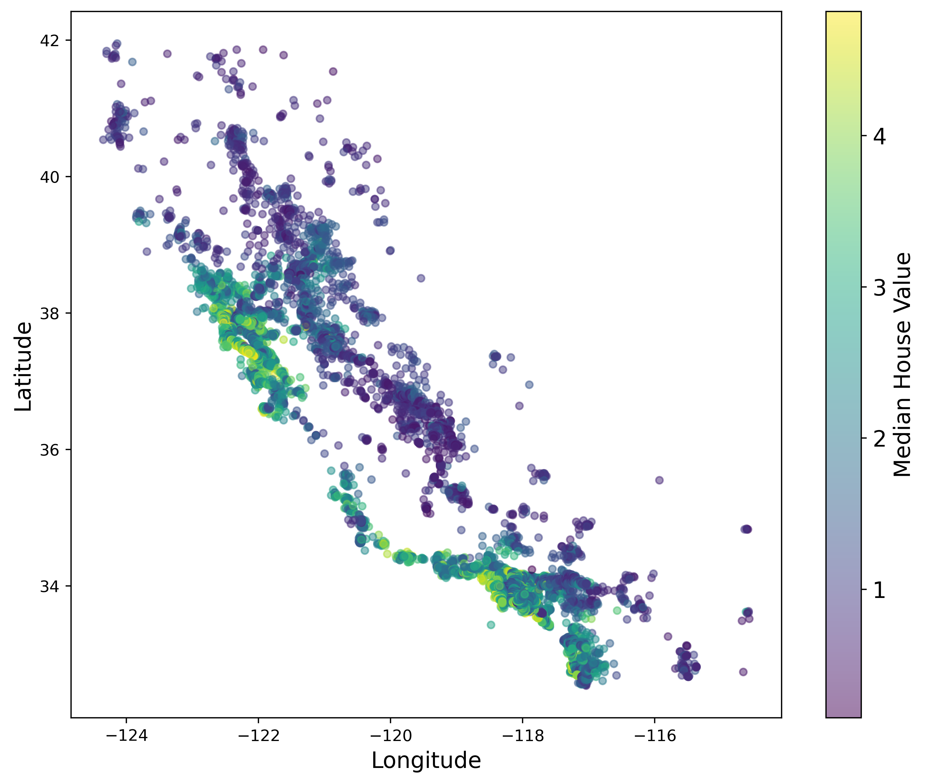
This next plot displays the price by location, with green being the most expensive. It’s interesting to note that the points show a graphical representation of the state of California. We also see that our conclusion about the expensive houses being in two locates was indeed correct. The most expensive houses are located on the coast of Southern California (i.e. San Diego, Los Angeles) and Northern California (i.e. San Fransciso).
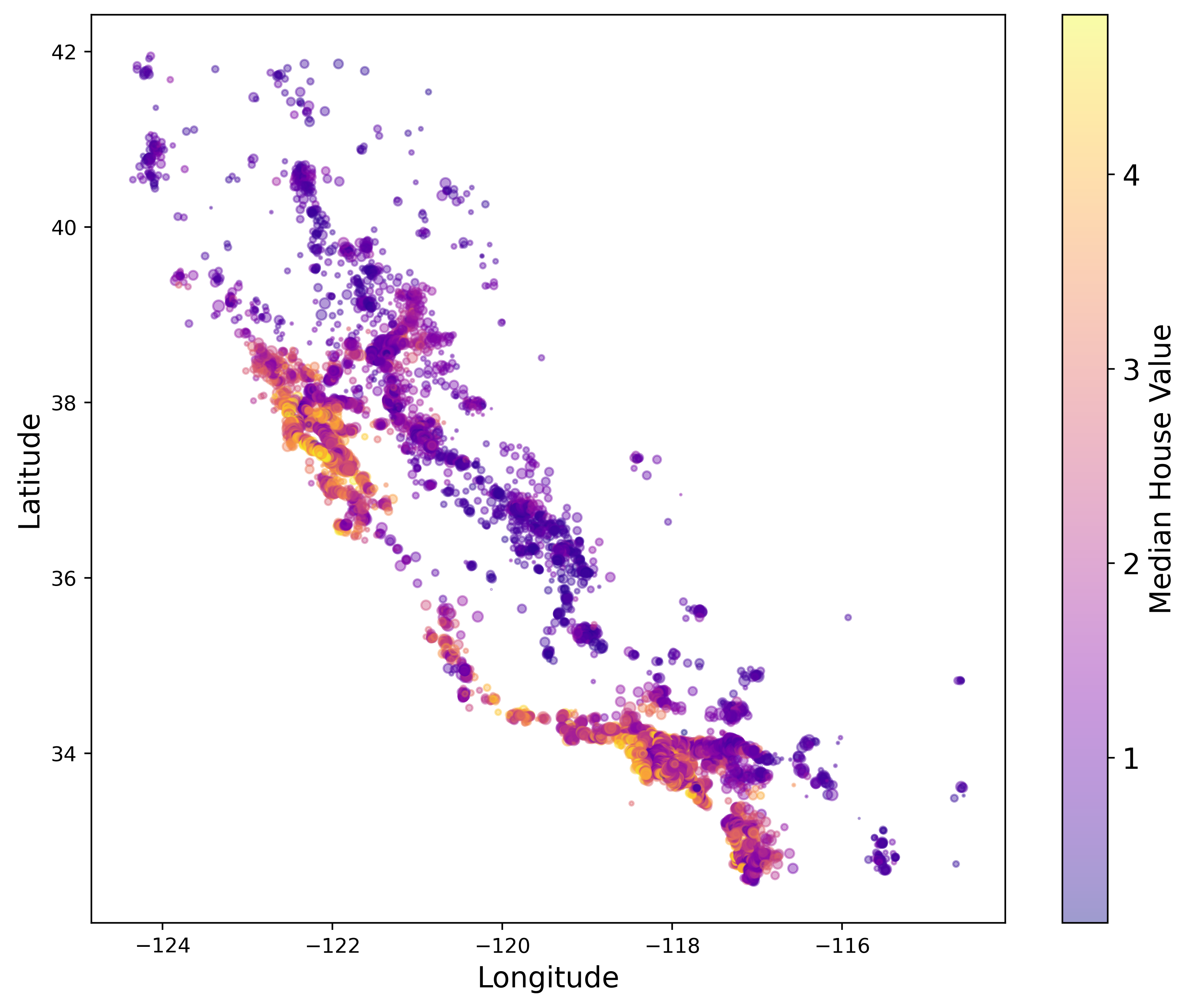
This next plot displaces price by location, but also accounts for the population size by plotting circles where the radius is determined by the total population in that region. For example, the biggest circles are located on the coast of California. This makes sense since we know that the places with the highest population sizes are San Diego, Los Angeles, and the bay area to name a few. On the other hand, as you go further inland you find that on average the population decreases.
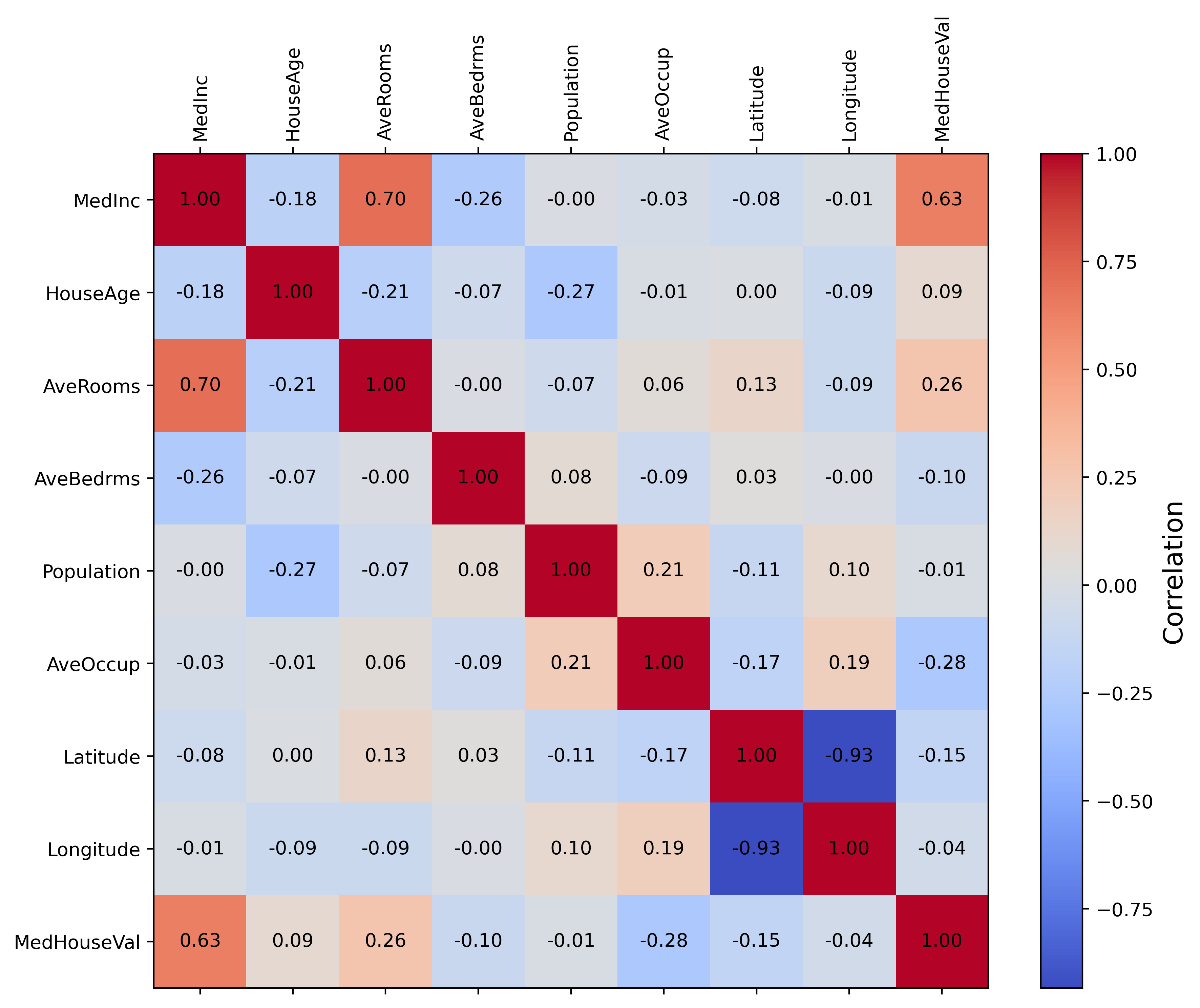
Next, we have a correlation map which tells us how each feature correlations to each other. For example, house age has no correlation to the median income, but median income has a positive correlation to average rooms and median house values. Latitude and longitude also have a high positive correlation with each other. This most likely relates to the two spikes we see in the histogram for these features. Overall, it seems that only a small subset of features actually correlation with each other.
We have now gone over the data that we will be using to train our MLP. Overall, this is a standard dataset used in introduction to machine learning courses. While it is considered simple and easy to use, it is great for early demonstrations of model building and hyperparameter tuning.
Feel free to reach out if you have any questions about what we covered this week. Next time we will train the model, tune hyperparameters, and learn ways to debug if issues arise. Stay tuned!